Restaurant signage design matters long before someone makes a reservation.
It should, ideally, work its magic when they’re walking past, half-distracted, wondering where to eat, and something catches their eye.
I’ve watched people (and sometimes been the person!) navigating unfamiliar neighborhoods, phones out, looking for an address.
They’ll walk right past a place without its number visible, circle back confused, maybe give up entirely.
Meanwhile, the restaurant with clear signage, number and name both visible from 50 feet, they find instantly.
First impression can be made before they’ve even opened the door.
This isn’t to insist on being loud or flashy.
But being legible, being memorable, being true to what you’re actually serving are all so important.
What Signage Actually Does
The obvious function is wayfinding.
People need to find your restaurant, identify which door to enter, locate bathrooms once inside, understand where to order or where to sit.
Studies on spatial cognition show that clear environmental cues reduce anxiety and improve experience (and executive function, for that matter!).
People feel more comfortable when they know where they are and where they’re going.
But restaurant signage design does more than direct traffic.
It creates rhythm and emphasis, and it tells stories about provenance: “Minnesota-grown,” “Family recipe since 1962,” “Bread baked daily.”
These are the anchors that help diners understand what they’re about to experience.
A chef I worked with in Northeast Minneapolis put it plainly, telling me her grandma’s recipe for pierogi is what makes her place special.
But no one would know that without being told.
Now, there’s a small sign above the prep station, visible from the dining room, with her grandmother’s photo and a line about family tradition.
It’s become the most-photographed spot in the restaurant.
Signage is also where your brand becomes physical.
Your logo, your colors, your typography, these live mostly on screens and menus.
But signage makes them three-dimensional, architectural, permanent.
Get it right and it reinforces every other piece of your visual identity.
Get it wrong and it creates dissonance that’s hard to overcome.
The Hierarchy of Visibility
Not all signs need equal prominence, which is good because there’s limited space and attention.
Visual hierarchy is about organizing information so people process it in the right order.
Primary signage, or your main exterior sign, the one that identifies your restaurant from the street, needs to be prominent, readable, lit if you’re open after dark.
This is where you invest in quality materials and professional installation.
The SEGD (Society for Environmental Graphic Design) recommends that primary signage be readable from at least 50-100 feet during the day, with letter height minimum of 10-12 inches for street visibility.
Secondary signage includes window graphics, door pulls, “open” indicators, hours of operation.
These need to be clear but shouldn’t compete with primary signage.
Think of them as supporting information., answers to the questions people ask once they’ve already decided to come in.
Tertiary signage is interior wayfinding, menu boards, table tents, bathroom signs.
This is where you can get playful, where brand personality comes through in small details.
These signs are being read from three feet away by people who’ve already chosen to be there, so they don’t have to scream too loudly.
Materials and Durability
Minnesota weather will destroy anything that’s not genuinely exterior-rated.
It’s broken my heart, but I’ve seen beautiful wooden signs crack and warp after one winter.
Vinyl graphics peel, and paint fades faster than anyone predicts.
Materials worth considering for restaurant signage design in this climate:
- Dimensional metal letters: Aluminum or stainless steel, powder-coated for color.
- HDU (High-Density Urethane): Can be carved and shaped like wood but won’t rot, warp, or split.
- Porcelain enamel: Traditional material that’s seeing a revival.
- Neon and LED: Both have their place, as real neon has a quality of light that LED can’t quite match (that soft, warm glow), while LED is more efficient, more durable, and easier to maintain.
- Reclaimed wood with proper treatment: If you want that rustic aesthetic, it can work, but only if the wood is properly sealed, backed with weatherproof substrate, and protected by overhang.
Cheap vinyl is tempting because it’s inexpensive upfront.
But when it starts peeling after two years, replacement costs add up.
Take our advice: it’s better to invest in quality materials that last a decade or more.
Good commercial building design considers longevity from the beginning.
Typography and Readability
The most beautiful script font in the world doesn’t help if people can’t read it from across the street.
Legibility research is pretty clear: sans-serif fonts generally read better at distance, high contrast between letters and background improves recognition, appropriate letter spacing (tracking) matters more than most designers think.
But I’m not suggesting every restaurant needs to use Helvetica.
Character and personality matter too, of course.
What I’ve seen work well is a combination: distinctive typography for the restaurant name where it can be viewed up close (door, menu, website) and cleaner, more readable versions for signage that needs to work from a distance.
One Italian place in St. Paul uses a gorgeous custom script for their interior branding, with a hand-lettered feel, very European, and completely appropriate for what they’re doing.
But their exterior sign is a simplified version with clearer letterforms, better spacing, and properly lit.
It’s got the same character, just with better functionality.
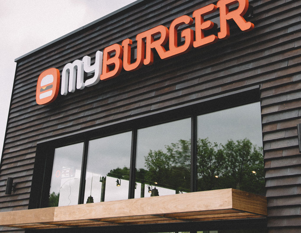
Letter size matters too, and perhaps more than people generally realize.
I would say 1 inch of letter height is equal to 10 feet of viewing distance.
So, if you want someone to read your sign from 100 feet away, you need 10-inch letters minimum.
That sounds huge until you see it in context, and then it makes sense.
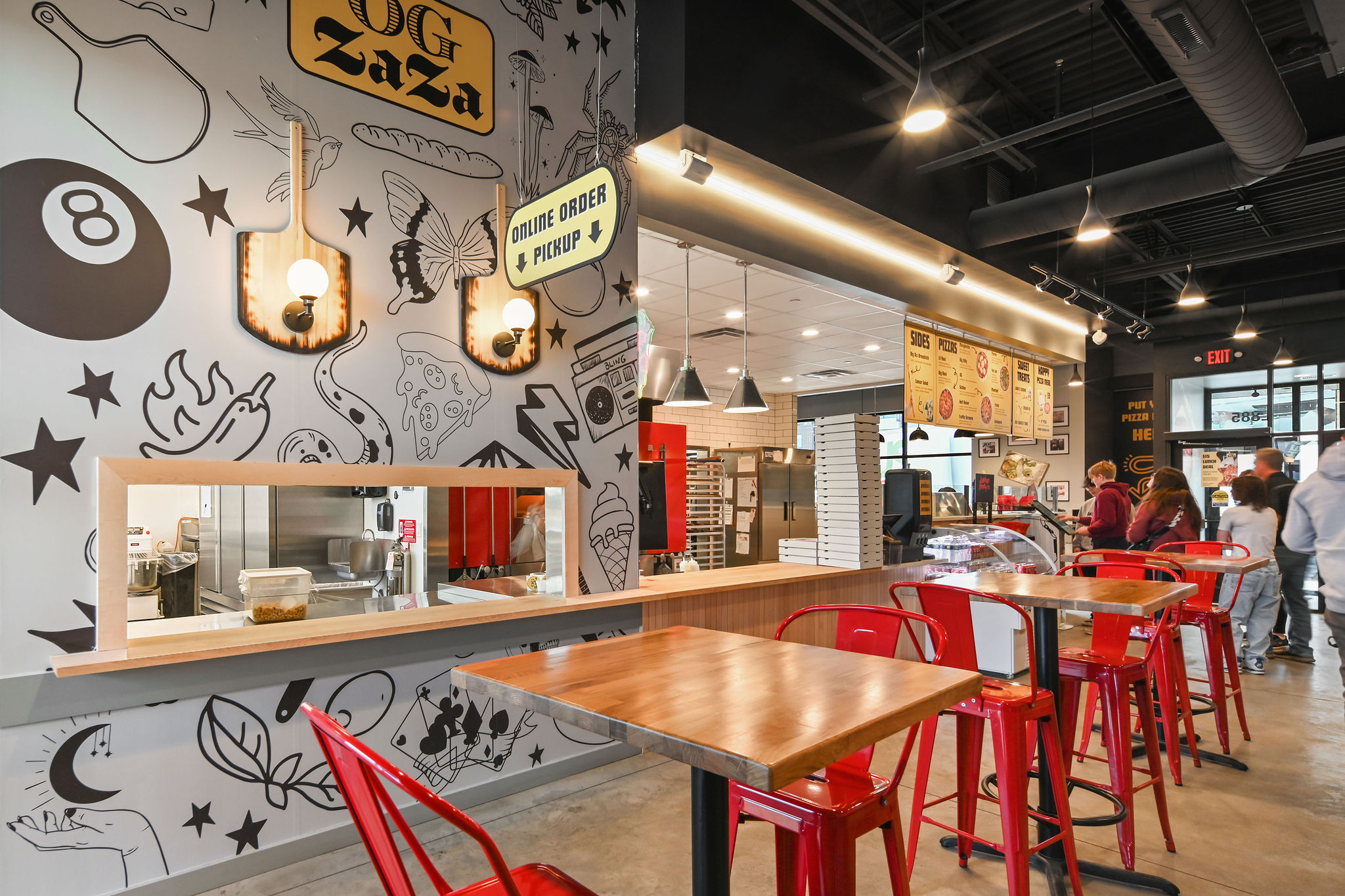
For OG Zaza, for instance, we’ve ensured their branding is clear and visible, while harmoniously integrating into the space at the same time:

Exterior Signage Strategy
Your building’s exterior tells people what to expect before they’ve committed to coming in.
This is where restaurant signage design becomes architectural, part of the building rather than added to it.
Blade signs (also called projecting signs) are traditional for restaurants, and there’s good reason they’ve persisted.
They’re visible from both directions of foot traffic.
They create three-dimensional interest.
They signal “establishment, something permanent” in a way that flat wall signs don’t quite achieve.
Window graphics deserve careful thought.
Full window coverage makes spaces feel closed off, not inviting.
But strategic use of window film for hours, logos, or menu highlights works well.
Frosted window film in particular cuts glare, creates privacy for diners, and gives you surface for typography or patterns.
Address numbers seem obvious but they’re frequently terrible: too small, wrong color, poorly placed.
Make sure your address is readable from the street, day and night.
Modern house numbers in 8-12 inch height, mounted with good contrast, properly lit.
If you have outdoor seating, consider incorporating signage into umbrellas, railings, or planters.
Subtle branding that reinforces identity without being aggressive about it.
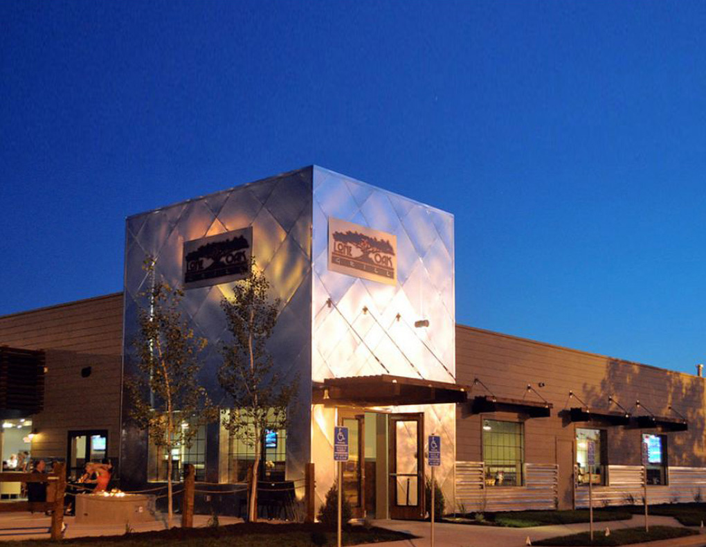
The contrast between the metal and wood on the Lone Oak Grill sign, for instance, gives a sense of what’s inside, neither blending in too much nor completely clashing with the building itself:
Budget Realities
Good restaurant signage design isn’t cheap, but it’s one of those investments that works 24/7.
A quality exterior sign reaches thousands of potential customers per day for years.
Break that down to cost per impression and it’s cheaper than any advertising you could buy.
That said, you can prioritize intelligently. Start with:
- Primary exterior sign (this is non-negotiable)
- Address numbers and “open” indication
- Essential wayfinding (bathrooms, exits)
- Window graphics or secondary identity elements
Then add:
- Interior menu boards or specials signage
- Decorative elements and brand reinforcement
- Photo-worthy moments or statement pieces
A small restaurant might spend $5,000-15,000 on signage.
Larger spaces or more complex buildouts can run $25,000-50,000+.
It’s a real line item in your restaurant build-out budget, and trying to cut too many corners here usually shows.
Learning From What Works
I spent an afternoon once just walking Uptown and Northeast Minneapolis, paying attention to restaurant signage.
What made me notice certain places? What helped me find addresses? What made spaces feel inviting versus intimidating?
The best signage worked so naturally that you didn’t think about it consciously.
The worst was either absent (making places hard to find) or trying too hard (signs that screamed but said nothing meaningful).
There’s a ramen shop I remember well that comes to mind because it did everything right:
Simple channel letters with their name, warm backlit glow at night, address numbers large enough to see from across the street, and subtle window graphics that show you can peek inside without feeling exposed.
It included a small blade sign that caught attention from both directions.
Nothing innovative or groundbreaking, just all the basics executed thoughtfully.
That’s what good restaurant signage design looks like most of the time.
If you’re building a new restaurant or rethinking your existing signage, we can talk about what’s possible.
Every space has its own requirements (sight lines, code restrictions, budget constraints).
But there’s usually more opportunity than you initially see.
Sometimes, it just takes looking from a different angle, considering how light hits surfaces, thinking about the whole journey from sidewalk to table.
That’s where good signage starts: with understanding the path, then marking it with intention and clarity.
Recent Comments